Gravitics
Gravitics
Gravitics
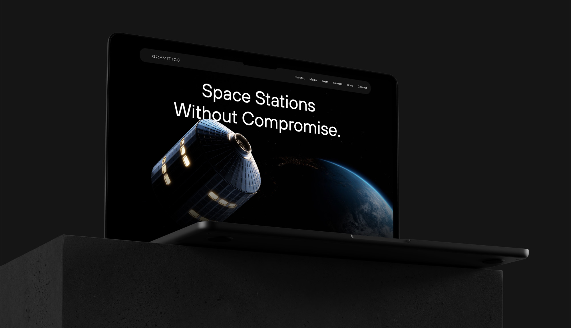
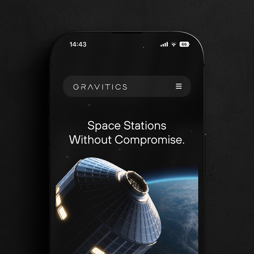
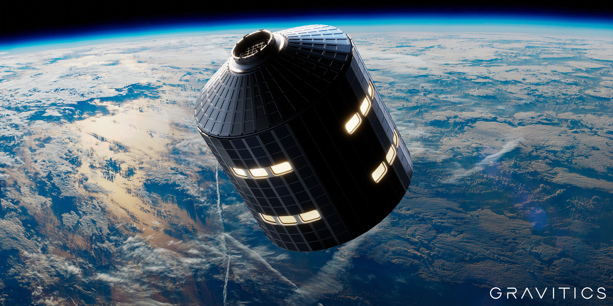
Gravitics is a developer of aerospace stations designed to form the building blocks for human life in space. The company’s modules utilize next-generation hardware to build space station modules with interfacing options and space armor to bring shipyard-style fabrication to the aerospace industry, enabling clients to execute their outer space missions effectively.
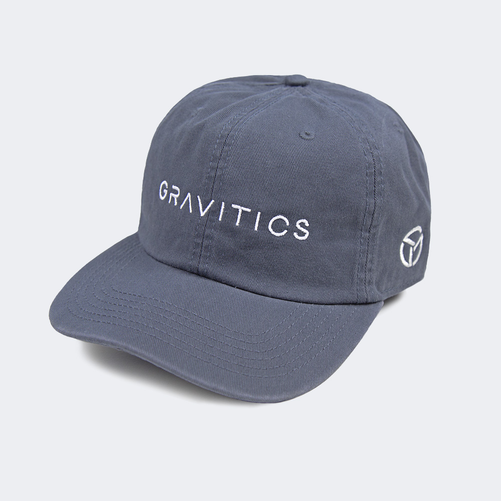
The logo design for Gravitics was developed to consist of a symbol and a logotype that are cohesive, distinctive and suitable for use in a variety of contexts. The symbol is an abstract visual element that represents the concept of rotation and gravity, while the logotype is a futuristic and lightweight typographic treatment of the company’s name. Spacing, cut-outs and a lack of crossbars give the type a unique look that allows it to seamlessly integrate with the other elements of the brand’s visual materials.
Gravitics is a developer of aerospace stations designed to form the building blocks for human life in space. The company’s modules utilize next-generation hardware to build the space station modules with interfacing options and space armor to bring shipyard-style fabrication to the aerospace industry, enabling clients to execute their outer space missions effectively.
The logo design for Gravitics consists of a symbol and a logotype that are cohesive, distinctive and suitable for use in a variety of contexts. The symbol is an abstract visual element that represents the concept of rotation and gravity, while the logotype is a typographic treatment of the company name that is legible and harmonizes with the symbol.
Role: Logo Design
Agency: ByAllMeans for Staff Only
Client: Gravitics
gravitics.space
Role: Logo Design
Agency: ByAllMeans for Staff Only
Client: Gravitics
gravitics.space


More Projects
More Projects

